Killington Resources
Everything you need to claim your perfect day on the mountain.
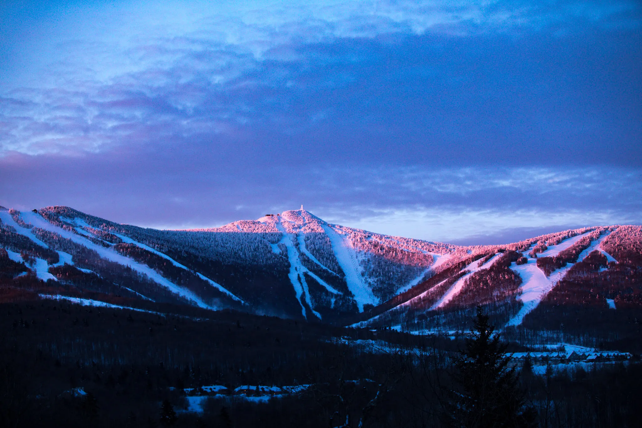
More Mountains Than You Can Ski in a Week
With seven mountains, including Pico, Killington is bigger than anything you’ll experience in the east – some 11 miles from border to border. Killington also offers the highest lift serviced skiing in New England and the greatest vertical in New England at 3,150’, but they aren’t just for the experts in the crowd.
Sure they’ve got 200 trails that include knee-buckling bump runs, and breath-grabbing steeps and cruisers, like favorites Downdraft, Ovation, and of course Outer Limits, the steepest mogul slope in New England. But, they also offer beginner and intermediate routes down from each of the resort peaks. This includes their 6.6 mile Juggernaut trail that’s the longest in the East. All in all it shakes down to just under 90 miles of the greatest slope and trail diversity in the east, and the greatest adventure on skis.
You can find out more about the Killington area with these great resources: