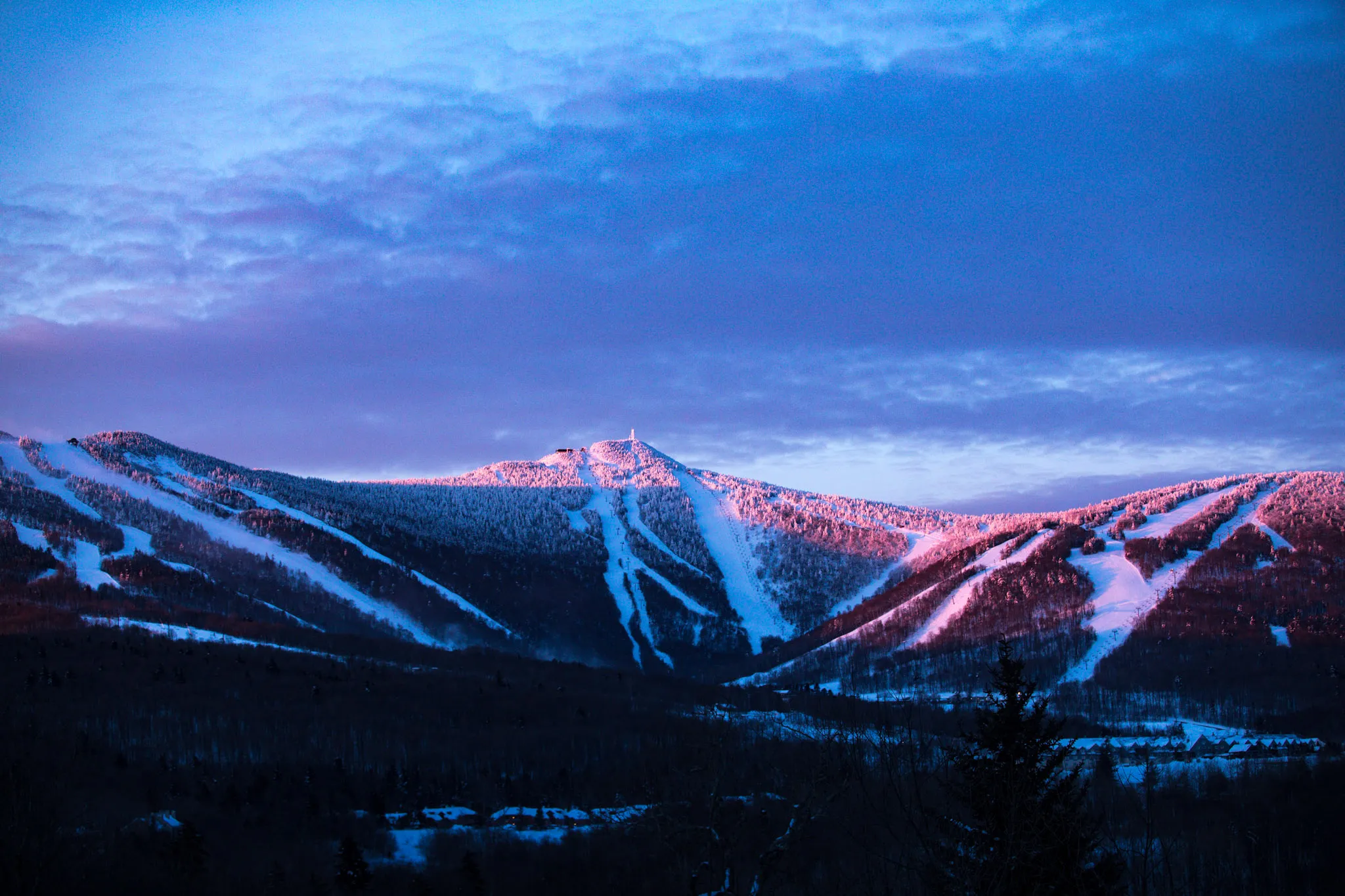
The Killington Insider blog is reporting today that Killington’s new marketing campaign is actually a return to their past glory, once again branding Killington as the “Beast of the East.”

Their more recent tag lines, “Endless Adventures,” “Rise Above” and “Nowhere Else,” now seem quaint as Killington seeks to reclaim its former glory for being the best ski resort on the East coast.  As they clearly state,

For too long, we’ve let other mountains compare themselves to Killington. Fact is no other resort in the Northeast can compare to Killington in terms of size, terrain, lifts and snowmaking. No other resort area has a five-mile long access road loaded with the best après, dining and nightlife you’ll find in ski country.

With the updated tag line also comes a new logo, which we think is a retro, yet stylishly modern design and a much needed improvement over their dated former logo.  Judge for yourself:

Old Logo

Old Killington Logo

New Logo

New Killington Logo

Now that’s something we’d actually wear on a t-shirt or hat.

In addition to their new tag line and logo, over the next few weeks, they will be rolling out a new web site, the new look and a new advertising campaign.  The ad campaign actually references thebeast.killington.com, but for now that site simply redirects to their main web site.  You can check out a couple of the ads below.


Killington Ski House

Killington, VT Ski Share House

5 Comments

hnee · October 9, 2009 at 10:46 am

Gotta disagree. I perfer the old logo much better. Hate the crest

    @snowdazeVT · October 9, 2009 at 12:58 pm

    I have to imagine there are always going to be a wide degree of opinions anytime a major change is made. I wasn't sure I liked it at first, but it grabbed me. The old one just seems so dated.

    I like that the new crest incorporates a mountain (the black triangle), sideways "K" (the blue and green), and the three colors of the ski run difficulty ratings. Clever and catchy in my opinion.

MissMaddie · October 9, 2009 at 2:07 pm

Love the new logo. Welcome to the 2000s. As for claiming to be the best? Have you been to the Stowe's front 4?

Wayat Konholen · December 19, 2009 at 3:16 am

I don't give a damn about the logo. Or the marketing campaign. Just make snow, run the lifts. What would catch my fancy would be lower ticket prices, lower food prices at the lodges. What would really be news is better pay for employees. And "Yes, we scan" buttons for those over-zealous ticket-checkers that have to scan you 20 times a day. The beast still needs to lose a lot of fat to really be lean and mean skiing machine deserving the old marketing name.

tannar boyer · February 5, 2011 at 2:52 am

sugarloaf is far better than killington in every way. its taller bigger colder and bolder. 752 acres at killington vs. 1437 acres at sugarloaf.

Leave a Reply